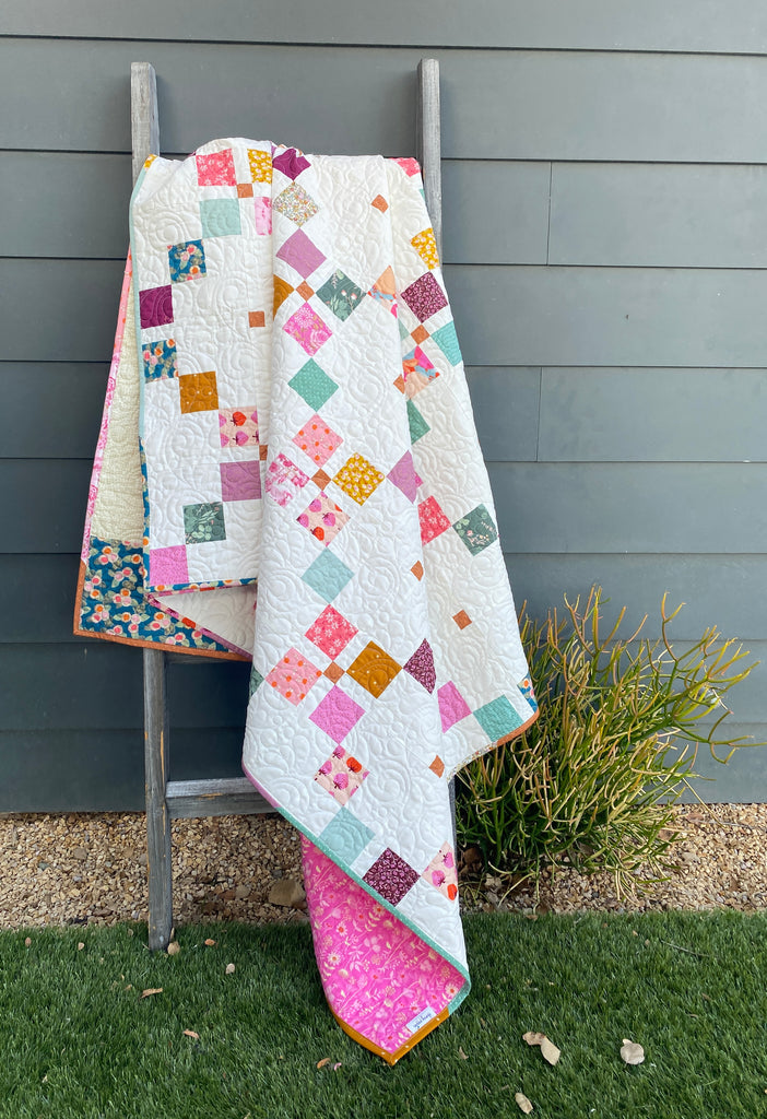
Maybe some of you joined me back in Sept/Oct for my 2nd ever Quilt Along? We spent almost 2 months slowly working on a Harken Quilt together. I had so much fun hosting this event each week. The Harken Quilt Pattern lays out instructions for both a Classic and a Scrappy version. For more process posts on both my versions you can head to my Instagram HERE!

So I couldn't resist making one of each for the QAL. It was challenging to keep up with the sewing each week but honestly, it was so fun seeing them both come together, that it really motivated me to keep going.

This super scrappy happy version was incredibly fun to create. A Part 2 blog post will follow soon with more about this one. While I loved making both of them, today I want to share more about the classic version.

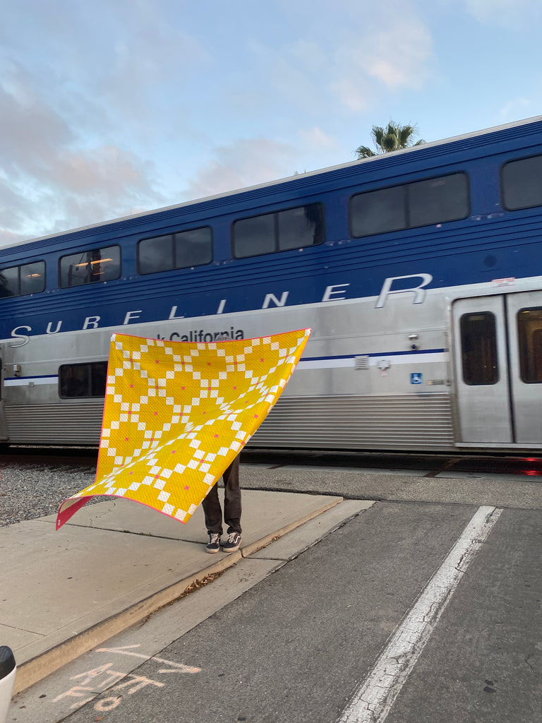
For the Classic Version, I chose to go for a color palette that I had been envisioning for a while but never had quite the right design for. The Harken Quilt was the one!

The idea of a two (or three) color quilt, has been something I've been wanting to create for years. While bright yellow and hot pink isn't exactly a "classic" palette, I decided I just had to bring my vision to life. I chose Art Gallery Pure Solids in Empire Yellow and Cactus Flower. The white fabric is actually a very delicate print of pink and white from the Tails and Threads Collection by Patty Basemi for Art Gallery Fabrics.

These three fabrics came together so nicely and were such a treat to work with. I actually surprised myself by choosing this extremely bright yellow for the background. As you might know, I tend toward more subtle palettes. The idea of this much vibrant yellow was definitely out of my comfort zone. Sometimes you just have a vision that you have to see come to life! So glad I didn't shy away from it.

For the backing on this one, I just pieced together what I had in my stash bins. Pieced backings are some of my favorites. They allow me to create as I go in a way, kind of like large scale improv.

As for quilting on this one, I wanted to keep it modern and clean. I felt like this would compliment the clean and minimal nature of the design. I was tempted to do another set of diagonal lines to make a diamond shape pattern but in the end, I'm glad I kept it on the more modern side. The lines are spaced 1" apart, which meant a bit more time but again, adds to the modern aesthetic of the overall design.
 I decided to choose the pink for the binding as well as the third color "pop" within the quilt! It is just too fun of a color not to use it twice:-)!! The Harken Quilt pattern is written with the Classic version using two colors but has an option to add the optional third color.

I'm happy I chose to do that here. Sometimes you just want that little extra "pop"!

I'm so happy with how this one turned out. Although it's hard to part with, I am considering listing it for sale. If interested in this one, please comment below or DM me through Instagram.
If you'd like to make a Harken Quilt in the colors you love or maybe one like this, you can find the pattern HERE on my website or HERE in my ETSY shop.

Thanks for reading my blog post. Happy sewing!
P.s. Check out a little video on how I finished off the big stitch binding on this one, bloopers and all.
~Karen

